A FRESH START IN ARLINGTON
Raise your hand if you’ve ever enjoyed moving. Anyone? Of course not. And imagine moving from New York to Arlington, into a larger home, with two small children and having to stay on top of your active career demands. Exhausting. That’s what our clients were juggling when they reached out to Manlove and Company Interiors.
Photo: @angelanewtonroyphotography
We couldn’t wait to help our clients get excited about their fresh start in Arlington. Their priorities were to have a finished home that suited their lifestyle and be able to comfortably host family and friends for gatherings and holidays. They needed us to provide a full design for their entire first-floor and, more importantly, they needed our team to manage everything so they could focus on their young children and work.
So, let’s take a tour of the house…
FOYER AND STAIRWAY
We believe inspiring home decor starts right at your front door. For the foyer, we chose a highly textured graphic cabinet to break up the long hallway and create a focal point at the bottom of the stairs. The metal rimmed mirror creates a graphic statement that also reflects the sunlight to brighten up the hall.
Photos: @angelanewtonroyphotography
Busy households benefit from long-wearing stair runners to cut down on sound, as well as provide safe footing for little ones, pets and grown-ups alike. In this home we installed a beautiful wool stair runner to bring their soft earthy palette onto all levels.
Left Photo: @angelanewtonroyphotography
DINING ROOM
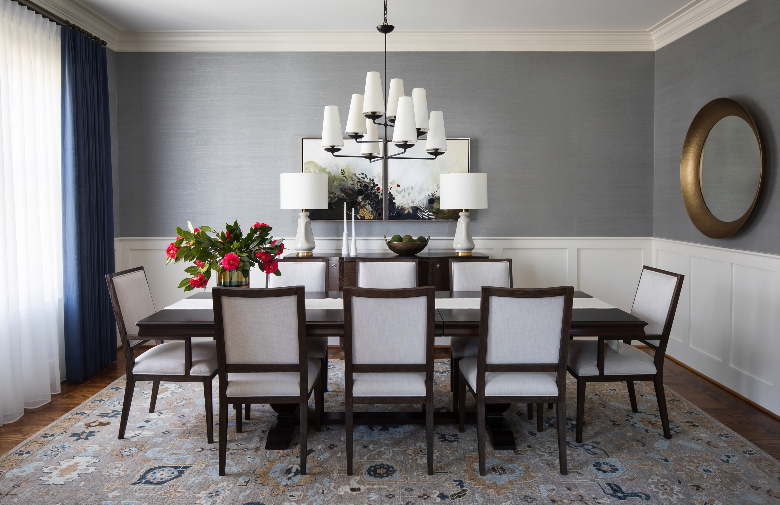
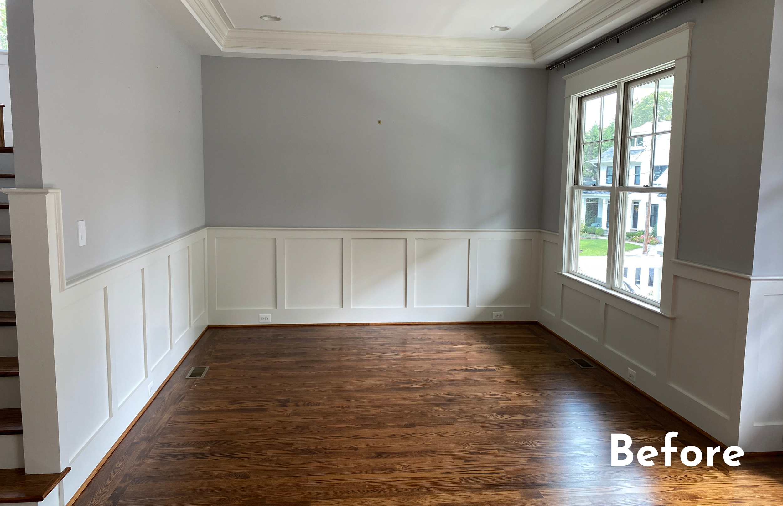
This elegant dining room is located at the front of the house and makes a big first impression with its blue/grey grass cloth wallpaper and deep blue drapery. Sheers under the panels provide privacy and soften the light during the day. We love large floor coverings, like this hand-knotted wool rug in a myriad of blues and neutrals to create a solid foundation for the furnishings.
Photo: @angelanewtonroyphotography , Art: @ashleysaudermiller
With a mix of traditional and modern, this room complements the natural tones of the rest of the house, while feeling a little bit more polished. The solid wood table in dark ash wood is reminiscent of our client’s childhood home and can seat up to 8 with the extension. A dramatic ceiling fixture draws your eye up.
Photo: @angelanewtonroyphotography , Art: @ashleysaudermiller
And we LOVE the original diptych paintings by Ashley Sauder Miller (@ashleysaudermiller). They bring in loads of textures and natural colors and serves as a dramatic focal point. If you want to learn more about Ashley’s art, please check out our interview with this talented artist on our blog.
LIVING ROOM
This room off the front hallway was empty when we started the project. It’s the first room you see when you come in, so it needed to set the tone for the rest of the home. Working with our clients we decided it would make a great lounge area, perfect for reading, enjoying a morning cup of coffee with your iPad or a spot to enjoy “adult conversation,” especially when the family room was filled with children. The bold green chairs and the notable brass coffee table create a casually elegant tone for the rest of the house.
After Photo: @angelanewtonroyphotography , Art Between Shelves: @jmccarten
BREAKFAST NOOK & KITCHEN
Our challenge was to take a white box off the kitchen and turn it into a comfortable cozy nook for daily meals. As one of the busiest rooms in the house for this young family, we hung wipeable vinyl wallpaper in a textured pattern to add warmth and dimension. We decided that a round table was the best way to maximize the room, with a custom cut area rug (no chairs falling off the rug!). The oversized light pendant creates an interesting graphical element and fills the room with soft light. Comfy chairs with casual woven backs are seated in easy care leather looking vinyl (stylish and functional). The art in the breakfast room is by local artist Joyce McCarten.
Photos: @angelanewtonroyphotography , Art: @jmccarten
FAMILY ROOM
We designed their main first floor room with loads of seating for family gatherings, entertaining, hanging out, and play time. Our clients requested neutrals with some pops of color for a calm space. We used shades of soft blues, mustards, browns, taupes and grey and combined them with plenty of texture like nubby fabrics, leather, hair-on-hide, woods and metal.
Photo: @angelanewtonroyphotography , Fireplace Mantle Art: @cameronwilsonritcher
Some of our favorite features include the beautiful ceiling fixture because it emphasizes the beautiful, coffered ceiling without competing for attention. Also, the oversized and exuberant tripod floor lamp commands attention from the corner.
Photos: @angelanewtonroyphotography , Fireplace Mantle Art: @cameronwilsonritcher
We placed a long console behind the sofa to create a natural break from the kitchen area, and with hair-on-hide stools underneath providing additional seating when needed. Floor length drapery in a muted blue provides privacy in the evening. The mixed media piece above the fireplace is by Cameron Ritcher (@cameronwilsonritcher). To learn more about Cameron, check out our interview here.
Photos: @angelanewtonroyphotography
It’s a special feeling knowing that we helped this family plant roots in Arlington. Here’s to many years of creating timeless memories in their new home. XOXO
Is your home ready for a refresh? We can help. Take a minute to complete our Design Survey and we’ll schedule a complimentary Discovery Call to discuss the possibilities.


